Exercise 7
Warning
Please note that we provide assignment feedback only for students enrolled in the course at the University of Helsinki.
Start your assignment
You can start working on your copy of Exercise 7 by accepting the GitHub Classroom assignment.
Exercise 7 is due by the end of the day on Tuesday, December 17.
You can also take a look at the open course copy of Exercise 7 in the course GitHub repository (does not require logging in). Note that you should not try to make changes to this copy of the exercise, but rather only to the copy available via GitHub Classroom.
Hints for Exercise 7
Adding a cell for the misfit function
This isn’t really a tip, but rather a suggestion that you copy/paste your chi_squared() function from the cell where it is defined up to a new cell above the age_predict() function.
This will make sure your code works when running the entire notebook from the first cell.
Comparing a single predicted age to multiple measured ages
As mentioned in Part 3 of Problem 1, you need to modify the calculation of the chi-squared value to compare the list of measured ages to a single predicted age. The easiest way to do this is to simply pass in a single age and refer only to that value in the calculation of chi-squared. In other words, make sure you do not have an index used with the predicted age in the chi-squared equation in your function.
Problem 1, Part 3
When calculating the misfit inside the age_predict function, notice that the values used as standard deviation should be filtered to have the same indices as the ahe_data data series, for example.
If the ahe_data series looks something like this (left side is indices and right side is some data values):
0 NaN
1 20
2 7
3 NaN
we would want to filter it to only have values and no NaN values:
1 20
2 7
Correspondingly, the original error/standard deviation might look like this:
0 100
1 40
2 9
3 NaN
If you now filter the error/standard deviation by dropping the NaN values (like you did with ahe_data), the shape of ahe_data and the error/standard deviation will be different.
This is because the error/standard deviation would also have a value at index 0 while the ahe_data does not.
Thus, you have to filter the error/standard deviation to have the same indices as the filtered ahe_data:
1 40
2 9
We have done this kind of thing back in Lesson 5 of the Geo-Python course.
Problem 1, Part 4 example plot
Below is an example of a plot that is similar to what you should produce in Part 4 of Problem 1.
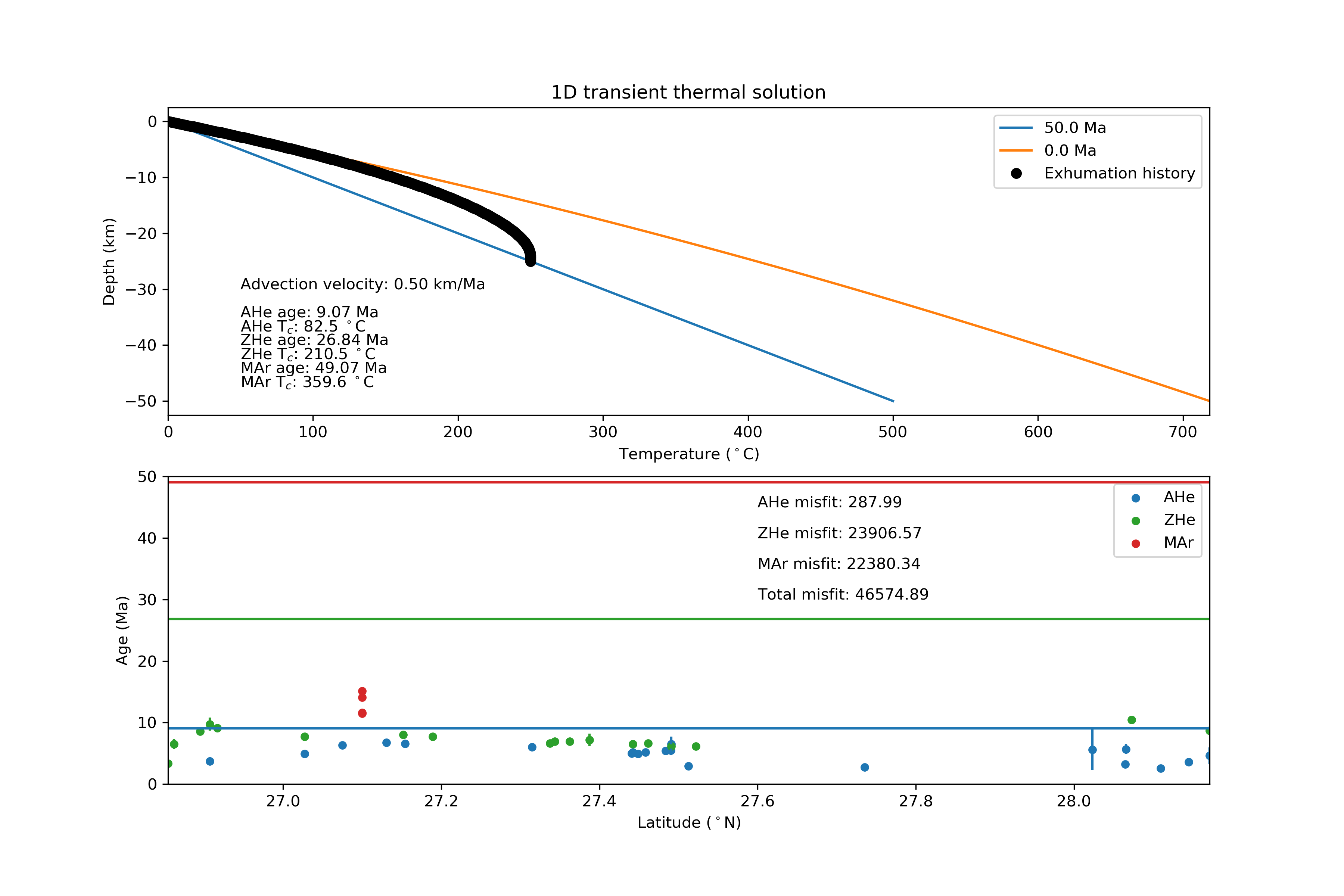
Figure 1. An example plot similar to that you should produce in Problem 1, Part 4.
Plotting predicted ages as horizontal lines
I suggest that you add horizontal lines to your plots of the thermochronometer data to show the predicted ages you calculate.
If you have read in the data file with the values for latitude stored in a variable latitude, you can plot a predicted age predictedAge as a black horizontal line as follows:
ax2.plot([data['Lat'].min(), data['Lat'].max()], [predicted_age, predicted_age], 'k-')
This will create a horizontal line from the minimum latitude to the maximum latitude with a vertical-axis value of predicted_age.
The “trick” here is to put Python lists into the ax2.plot() command instead of list or array variables.
Lists are values separated by commas within square brackets ([ ]), and here we just give 2 values in each list for the x and y points that define the ends of the line.