Exercise 7
Warning
Please note that we provide assignment feedback only for students enrolled in the course at the University of Helsinki.
Start your assignment
You can start working on your copy of Exercise 7 by accepting the GitHub Classroom assignment.
Exercise 7 is due by 12:00 on Monday 17.12.
You can also take a look at the open course copy of Exercise 7 in the course GitHub repository (does not require logging in). Note that you should not try to make changes to this copy of the exercise, but rather only to the copy available via GitHub Classroom.
Hints for Exercise 7
Removing -9999 age values
As noted in Exercise 7, there are some missing data values for different thermochronometers where an age was not calculated for a given sample.
These values are indicated with -9999 in the data file, and in order to calculate the reduced chi-squared misfit those -9999 values need to be removed.
Below is an example of how to remove missing data values indicated with -9999.
In [1]: import numpy as np

In [2]: ages = np.array([1.0, 3.2, -9999, 4.2, -9999, -9999])

In [3]: errors = np.array([0.2, 0.9, 0.0, 0.3, 0.0, 0.0])

In [4]: ages_clean = ages[ages > 0.0]

In [5]: errors_clean = errors[ages > 0.0]

In [6]: print(ages_clean)
[1.  3.2 4.2]

In [7]: print(errors_clean)
[0.2 0.9 0.3]
Comparing a single predicted age to multiple measured ages
As mentioned in Part 3 of Problem 1, you need to modify the calculation of the chi-squared value to compare the list of measured ages to a single predicted age. The easiest way to do this is to simply pass in a single age and refer only to that value in the calculation of chi-squared. In other words, make sure you do not have an index used with the predicted age in the chi-squared equation in your function.
Problem 1, Part 4 example plot
Below is an example of a plot that is similar to what you should produce in Part 4 of Problem 1.
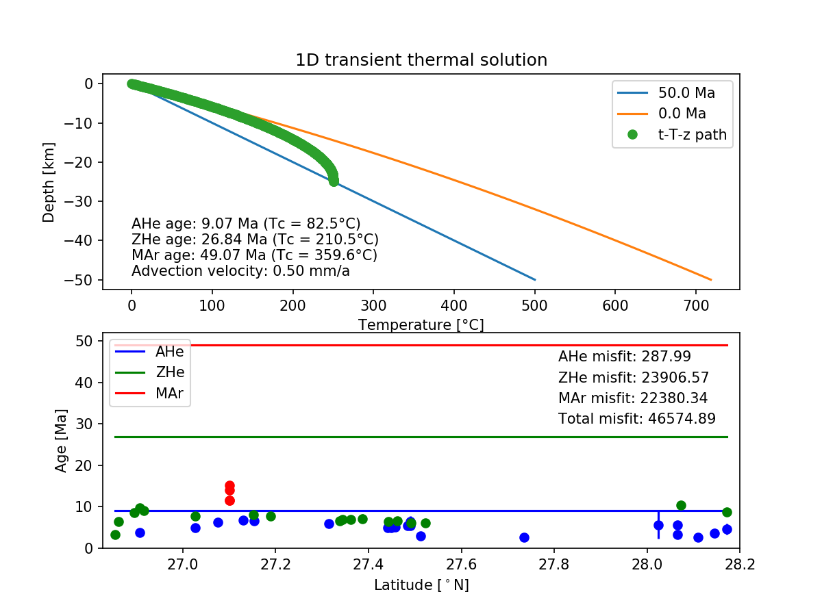
Figure 1. An example plot similar to that you should produce in Problem 1, Part 4.
Plotting predicted ages as horizontal lines
I suggest that you add horizontal lines to your plots of the thermochronometer data to show the predicted ages you calculate.
If you have read in the data file with the values for latitude stored in a variable latitude, you can plot a predicted age predictedAge as a black horizontal line as follows:
plt.plot([min(latitude), max(latitude)], [predictedAge, predictedAge], 'k-')
plt.show()
This will create a horizontal line from the minimum latitude to the maximum latitude with a vertical value of predictedAge.
The “trick” here is to put Python lists into the plt.plot() command instead of list or array variables.
Lists are values separated by commas within square brackets ([ ]), and here we just give 2 values in each list for the x and y points that define the ends of the line.