Hints for Exercise 8
General hints
Sigma notation
Sigma notation is used to indicate values that should be added together or summed. It is a shorthand notation to indicate the sum of \(N\) values, where each value in the set can be represented by the subscript \(i\). The example below shows how sigma notation works,
which is the sum of \(N\) values, each indicated by \(x\).
As you can see, the complete form explicitly states the starting and ending values for the sum (\(i = 1\) and \(N\)), but often these values are not written as it can be assumed that all \(N\) values will be summed.
Problem 1
There have not been any major issues with Problem 1, so the only suggested hint is to refer to the general hint on sigma notation above if you are having any problems with converting the equations for the mean, standard deviation, and standard error to Python.
Problem 2
Example plot for Problem 2
Below is an example of the type of plot you should produce for Problem 2.
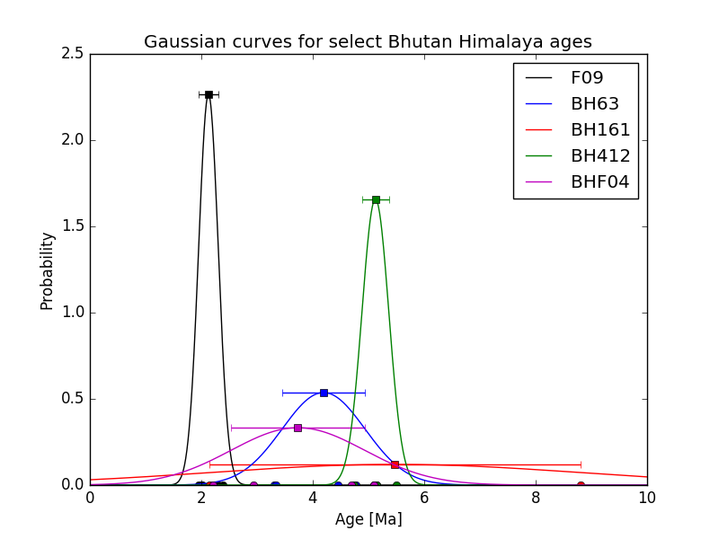
Example Gaussian plot for Problem 2.
Creating arrays of numbers between two values
As you may recall from this week’s lesson on using NumPy, we can use NumPy to create NumPy arrays of values between a starting and ending value. Consider the simple example below using the np.linspace() method:
In [1]: import numpy as np

In [2]: numberArray = np.linspace(0.0, 1.0, 11)

In [3]: print(numberArray)
[ 0.   0.1  0.2  0.3  0.4  0.5  0.6  0.7  0.8  0.9  1. ]
Here you can see we start with 0.0, end with 1.0, and produce an array of 11 equally spaced values that includes the starting and ending numbers.
This is probably the easiest way to create most arrays of this kind.
Creating and appending to lists
This is mostly a reminder of something we had seen back in Lesson 2 of the Geo-Python part of the course. When you are calculating the values for the normal distribution, one option is to create an empty list and append the calculated values to the list, calculating one value for each age in an age list/array from 0-10 Ma by 0.1 Ma. You can see an example below, which assumes you have created the NumPy array numberArray as shown the previous hint:
In [4]: dummyList = []

In [5]: for i in range(len(numberArray)):
   ...:     dummyList.append(numberArray[i]**2.0)
   ...:

In [6]: print(dummyList)
[0.0, 0.010000000000000002, 0.040000000000000008, 0.090000000000000024, 0.16000000000000003, 0.25, 0.3600000000000001, 0.4900000000000001, 0.64000000000000012, 0.81000000000000005, 1.0]
As you can see, dummyList ends up with the same number of values as numberArray (see previous hint), with one calculated value in dummyList for each corresponding value in numberArray.
Plotting similar items using a for loop
One part of Problem 2 is to create a plot in which a line, some points, and an error bar should all be plotted for each sample and using the same color.
This is an excellent opportunity to use a for loop to create the plots, rather than listing similar pieces of code to create each set of plotted items.
The main reason for using a for loop is that it becomes easy to modify the format of all of the plots at the same time by making changes within the for loop, but it does take some preparation.
For example, it is a good idea to create a list for the sample names and for the plot item colors before the for loop so that you can use those values within the for loop.
Consider the example below.
# Make some useful lists
In [7]: sampleNames = ['sample1', 'sample2', 'sample3']

In [8]: colors = ['black', 'blue', 'red']

In [9]: for i in range(len(sampleNames)):
   ...:     x = np.random.random(10)   # Random data to plot
   ...:     y = np.sin(x)
   ...:     x2 = np.random.random(10)  # More random data to plot
   ...:     y2 = np.cos(x2)
   ...:     e = np.random.random(10)
   ...:     plt.plot(x, y, 'o', color = colors[i], label = sampleNames[i])   # Make plots
   ...:     plt.errorbar(x2, y2, xerr=e, fmt='s', color=colors[i])
   ...:

In [10]: plt.show()
As you can see, with a bit of planning you can use a for loop for your plotting in Problem 2, which is suggested if you’re able to get it working.